The role of accent colours in interior design
In contemporary spaces, accent colours are taking on an increasingly central role, evolving from simple decorative details to true design features. They serve to give direction to the space, create depth, build focal points and, above all, define a recognisable identity.
In this scenario, Atlas Plan surfaces become an ideal tool because they allow for a continuous, controlled finish, capable of transforming colour into architecture.
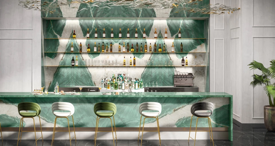
Zephyr, a surface that illuminates the space with lightness
When you want to accentuate elegance and contemporaneity, it is useful to use a colour that stands out in a measured way. Zephyr interprets this need well: a "luminous" accent, suitable for projects that focus on balance and visual lightness.
It is perfect for targeted areas such as backsplashes, niches, vertical screens or focal walls, where the surface can stand out without saturating the environment. The best effect is achieved when the accent is accompanied by warm, neutral supporting materials, so that the surface becomes a natural point of interest.
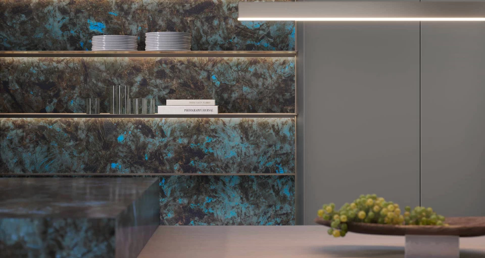
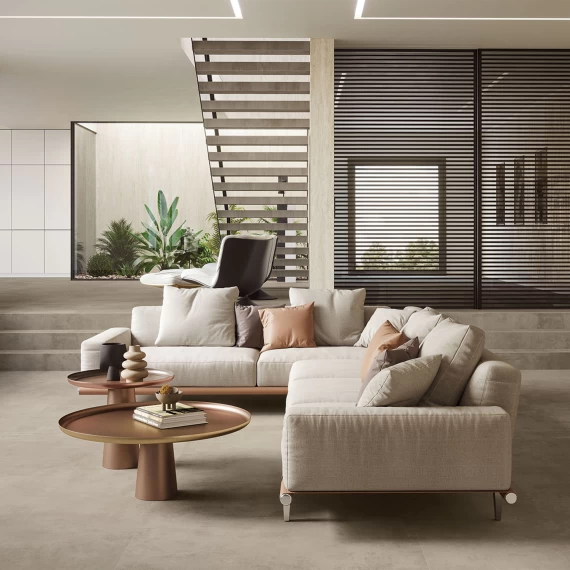
Baobab, a deep colour that creates atmosphere
One of the most interesting trends in colour is the search for deeper, more enveloping tones that not only paint the space but also create atmosphere. Baobab lends itself to this interpretation: a surface capable of adding intensity and character, working on the perception of depth and dialogue with light.It is an ideal choice for giving architectural volume to a space, defining a sophisticated environment with its own identity.
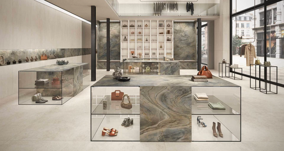
Exotic Wave, a surface with a graphic gesture
Today, the accent is not necessarily a uniform colour: increasingly, it is movement, variation, rhythm. This is where Exotic Wave comes in, perfect for projects seeking a bold and contemporary focal point.
This type of surface is ideal for a feature wall, a kitchen splashback, an impressive entrance hall or a covering that becomes part of the story: the graphics of Exotic Wave energise the space and define its mood.
Managing an accent colour correctly requires direction. An effective guideline is to work with focal points: choose one or two key areas (wall, backsplash, volume) and keep the rest in supporting shades to avoid a redundant effect.
Lighting is a fundamental aspect: an accent colour changes significantly between natural lighting, warm evening light and technical lighting, which is why it is useful to think of it as part of the lighting design.
Large slabs promote visual continuity, but for this very reason, they require careful positioning: when the accent is precisely calibrated, the space appears more harmonious, contemporary and memorable.